Choosing the right window furnishings can transform an ordinary room into a stylish, cohesive space. Curtains and blinds not only offer privacy and light control but also contribute significantly to the overall aesthetic. When carefully selected to complement your decor, they tie together your interior design, creating a polished and harmonious look.
In this guide, you’ll learn how to match curtains and blinds with decor using principles of design, colour theory and fabric selection — all aligned with the Australian Style Guide for clarity and elegance.
Understand the Purpose of the Room
The first step in matching curtains and blinds with your decor is to understand the function of the room. Living rooms often benefit from softer, flowing curtains that enhance comfort and warmth, while blinds may be more suitable for areas requiring light control, like kitchens or bathrooms. Bedrooms typically demand a combination of both — blinds for darkness and curtains for style and texture. Recognising the room’s purpose helps you determine the right materials, styles and colours, ensuring the window treatments enhance functionality without compromising design.
A formal dining room, for example, may call for luxurious fabrics such as velvet or silk to create a sophisticated atmosphere. Meanwhile, a casual space like a playroom might benefit from easy-to-clean blinds paired with lightweight curtains in cheerful hues. Understanding how a room is used influences the selection process and ensures that your curtains and blinds serve both practical and aesthetic needs.
Choose Complementary Colours
Colour is one of the most important elements when matching curtains and blinds with decor. Start by assessing the dominant colour palette of the room, including wall paint, flooring and major furniture pieces. Aim to choose curtains and blinds in shades that either blend seamlessly with the existing tones or create a subtle contrast that adds visual interest without overwhelming the space.
For a timeless, cohesive look, select window treatments in similar hues to your walls or furnishings. For example, if your living room features earthy tones like sand, clay or olive, opt for curtains in warm neutrals or natural fibres that echo those shades. Alternatively, if you want to introduce a bit of contrast, choose a complementary colour from the opposite side of the colour wheel. In a room with cool blue walls, warm-toned curtains in terracotta or soft gold can create a striking yet harmonious effect.
It’s also important to consider how natural and artificial light affects colour perception. A fabric that appears soft grey in natural daylight might take on a lavender hue under warm indoor lighting. Always view fabric swatches in the intended space and lighting conditions before making a final decision.
Balance Patterns & Textures
Mixing patterns and textures is an effective way to add depth and interest to your decor, but balance is key. If your room already features bold patterns — such as printed rugs, decorative cushions or wallpaper — opt for plain or subtly textured curtains and blinds. This approach prevents the space from feeling too busy or chaotic.
Texture also plays a crucial role. Linen, velvet, cotton and sheer fabrics all offer different sensory and visual experiences. For example, sheer curtains soften a room’s appearance and diffuse light beautifully, while heavier fabrics like jacquard or brocade add richness and warmth. When combining curtains and blinds, aim for complementary textures — such as pairing timber venetian blinds with soft linen curtains — to maintain visual cohesion.
Consider Hardware & Finishing Touches
Matching your window treatment hardware with the rest of the room’s accents — such as light fixtures, cabinet handles or furniture legs — helps create a unified look. Choose rods, brackets and tiebacks in finishes that reflect your overall design theme, whether it’s matte black for a modern feel, brushed brass for a touch of luxury or wooden accents for a rustic or coastal aesthetic.
In layered window treatments, consider how the blinds and curtains will function together. Roman blinds under floor-length curtains create an elegant, tailored look, while roller blinds behind sheer panels offer a modern, minimalistic appearance. Ensure the proportions work well together — for instance, the curtain length should ideally just graze the floor for a clean and considered effect.
Reflect Your Personal Style
While trends come and go, your home should reflect your personal taste and lifestyle. If you love bold colours, don’t be afraid to choose statement curtains in deep navy or rich emerald. If your style leans towards coastal or Scandinavian minimalism, crisp white blinds with pale linen curtains might be more suitable.
Ultimately, the goal is to ensure that your curtains and blinds enhance rather than distract from the room’s design. Thoughtful coordination of colour, texture and form will elevate your interiors and provide a backdrop that feels both cohesive and inviting.
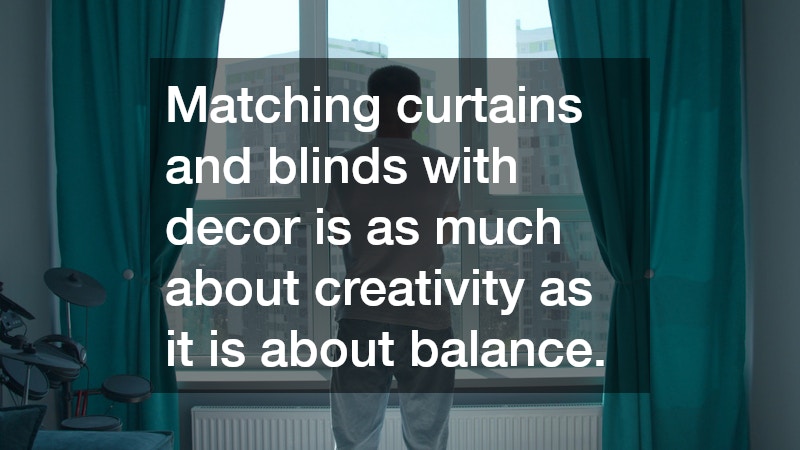
Matching curtains and blinds with decor is as much about creativity as it is about balance. By understanding the purpose of each room, selecting complementary colours, balancing patterns and textures, paying attention to hardware and reflecting your personal style, you can confidently choose window treatments that enhance both function and beauty. When chosen thoughtfully, curtains and blinds become an integral part of your home’s aesthetic story — subtle yet powerful elements that elevate every space they adorn.
.